Common Editor Settings
Reference for the Triggers, Display, and Customize tabs that are shared across all notification types.
Every notification editor in Cool Popup has four settings tabs: Main, Triggers, Display, and Customize. The Main tab contains type-specific fields (covered on each notification type's page), while the other three tabs are shared across all types with only minor variations.
This page documents the shared tabs so that individual notification type pages can reference it instead of repeating the same information.
Triggers tab
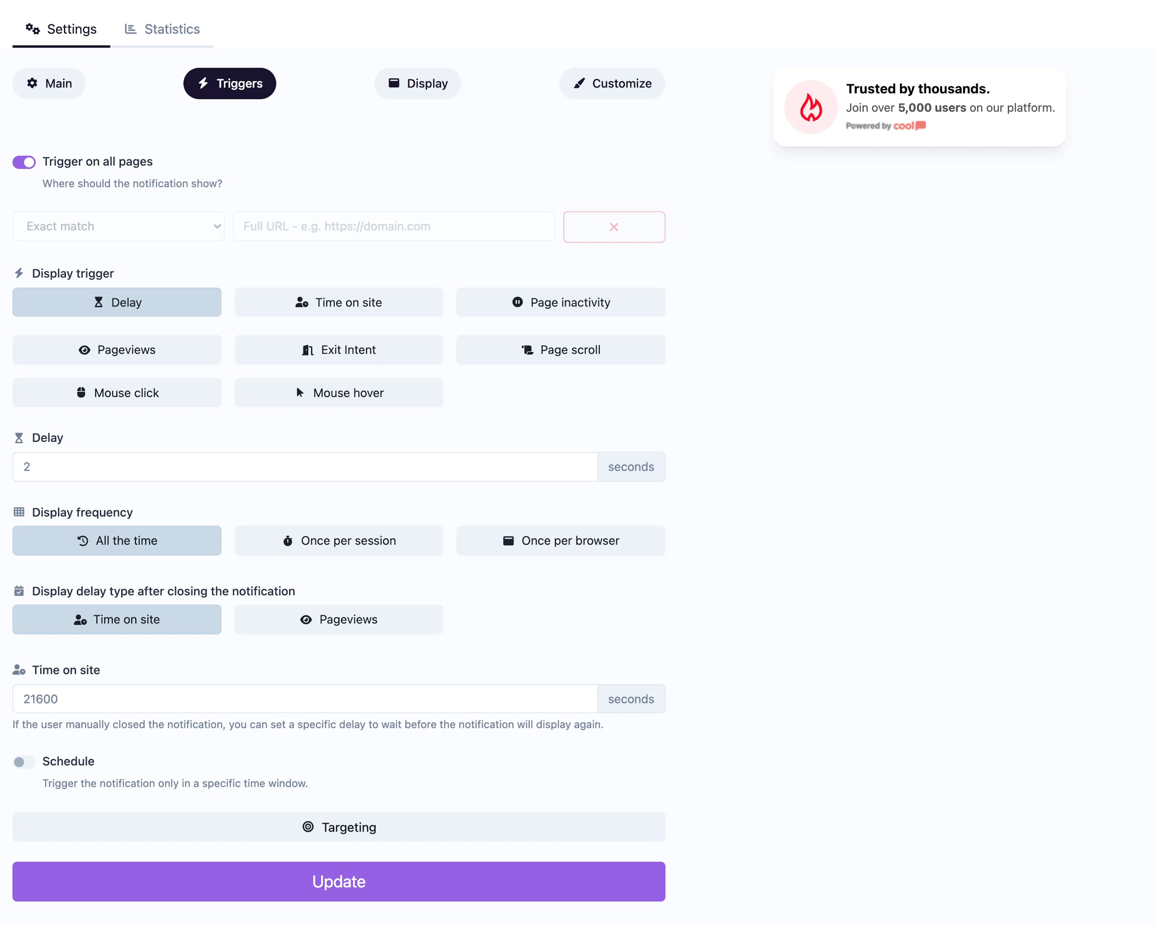
The Triggers tab controls when, where, and to whom your notification is shown.
Page targeting
| Field | Description |
|---|---|
| Show on all pages | When enabled, the notification appears on every page of your site. Disable to add URL rules. |
| URL rules | Define rules to match specific pages. Each rule has a condition (exact match, contains, starts with, ends with, page contains) and a value. You can also use negative conditions (does not contain, does not start with, etc.) to exclude pages. |
Display trigger
Controls how the notification is triggered:
| Trigger | Description |
|---|---|
| Delay | Show after a fixed number of seconds on the page. |
| Time on site | Show after the visitor has spent a total number of seconds on the site (across pages). |
| Inactivity | Show after the visitor has been idle for a set number of seconds. |
| Page views | Show after the visitor has viewed a set number of pages in the session. |
| Exit intent | Show when the visitor moves their mouse toward the browser's close/back button (desktop only). |
| Scroll | Show when the visitor scrolls past a percentage of the page. |
| Click | Show when the visitor clicks an element matching a CSS selector you provide. |
| Hover | Show when the visitor hovers over an element matching a CSS selector. |
Display frequency
| Option | Description |
|---|---|
| Every time | Show the notification on every qualifying page load. |
| Once per session | Show only once during the visitor's browsing session. |
| Once per browser | Show only once — ever — on that browser (uses a cookie). |
Re-show after close
If a visitor manually closes the notification, you can control when it reappears:
- Time on site — Wait a set number of seconds before showing again.
- Page views — Wait until the visitor has seen a set number of additional pages.
Schedule
Enable scheduling to restrict the notification to a date range. Set a start date and end date — the notification will only be active between those two timestamps.
Audience targeting
Expand the Targeting section to narrow your audience:
| Filter | Options |
|---|---|
| Continents | Africa, Antarctica, Asia, Europe, North America, Oceania, South America |
| Countries | Full country list |
| Cities | Comma-separated city names |
| Operating systems | iOS, Android, Windows, macOS, Linux, Ubuntu, Chrome OS |
| Browsers | Chrome, Firefox, Safari, Edge, Opera, Samsung Internet |
| Languages | Browser language codes |
| Devices | Toggle mobile and/or desktop visibility separately |
Display tab
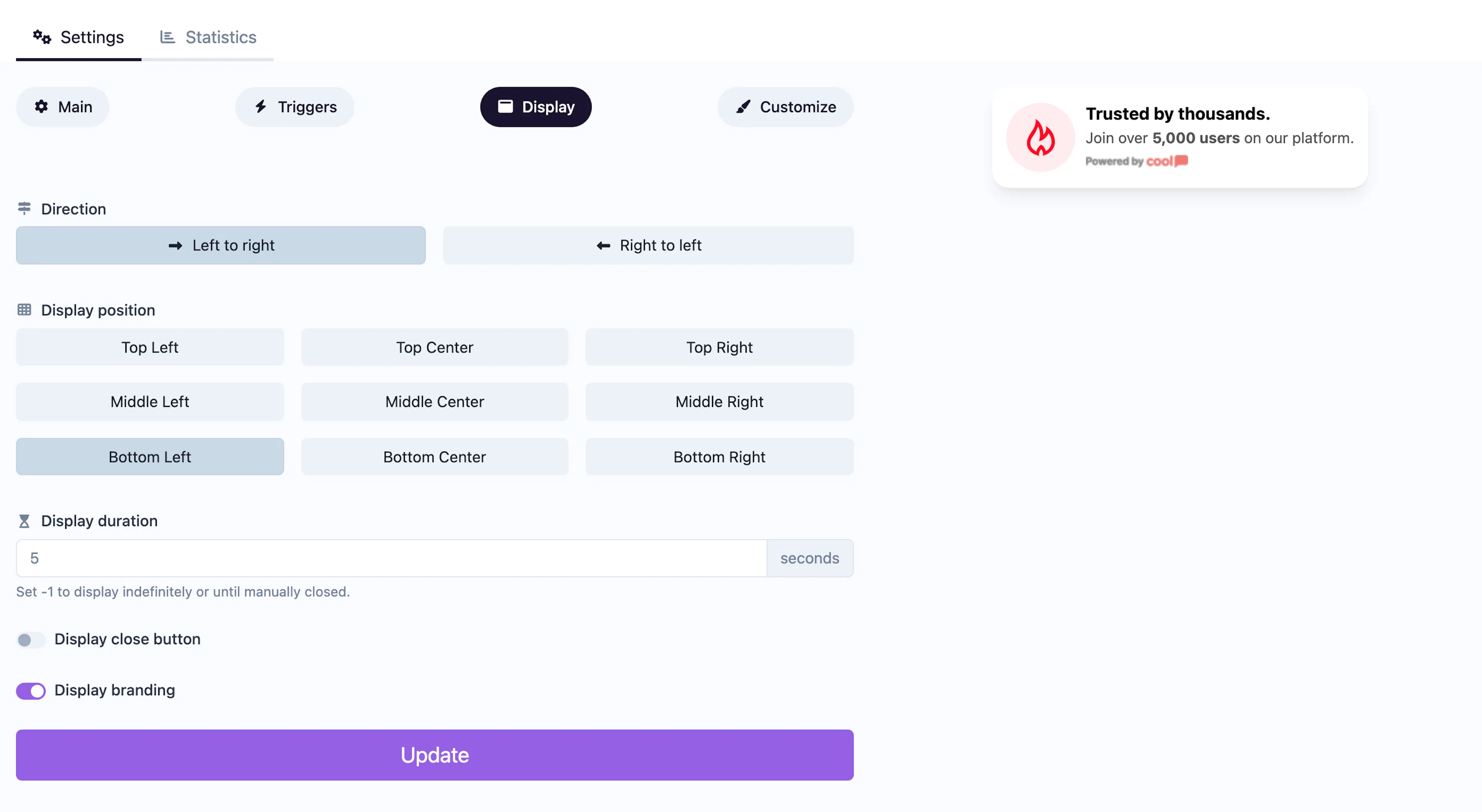
The Display tab controls the notification's position and behavior on screen.
| Field | Description |
|---|---|
| Direction | Set the text direction to LTR (left-to-right) or RTL (right-to-left). |
| Position | Choose from a 3×3 grid: top-left, top-center, top-right, middle-left, middle-center, middle-right, bottom-left, bottom-center, bottom-right. |
| Duration | How many seconds the notification stays visible. Set to -1 for "forever" (until the visitor closes it). |
| Close button | Toggle whether visitors can dismiss the notification. |
| Branding | Show or hide the "Powered by Cool Popup" badge. Hiding branding requires a plan that supports it. |
Some notification types add extra fields to the Display tab. For example, Live Counter, Conversions, and Conversions Counter add a Minimum activity threshold — the notification won't appear unless enough data points exist.
Customize tab
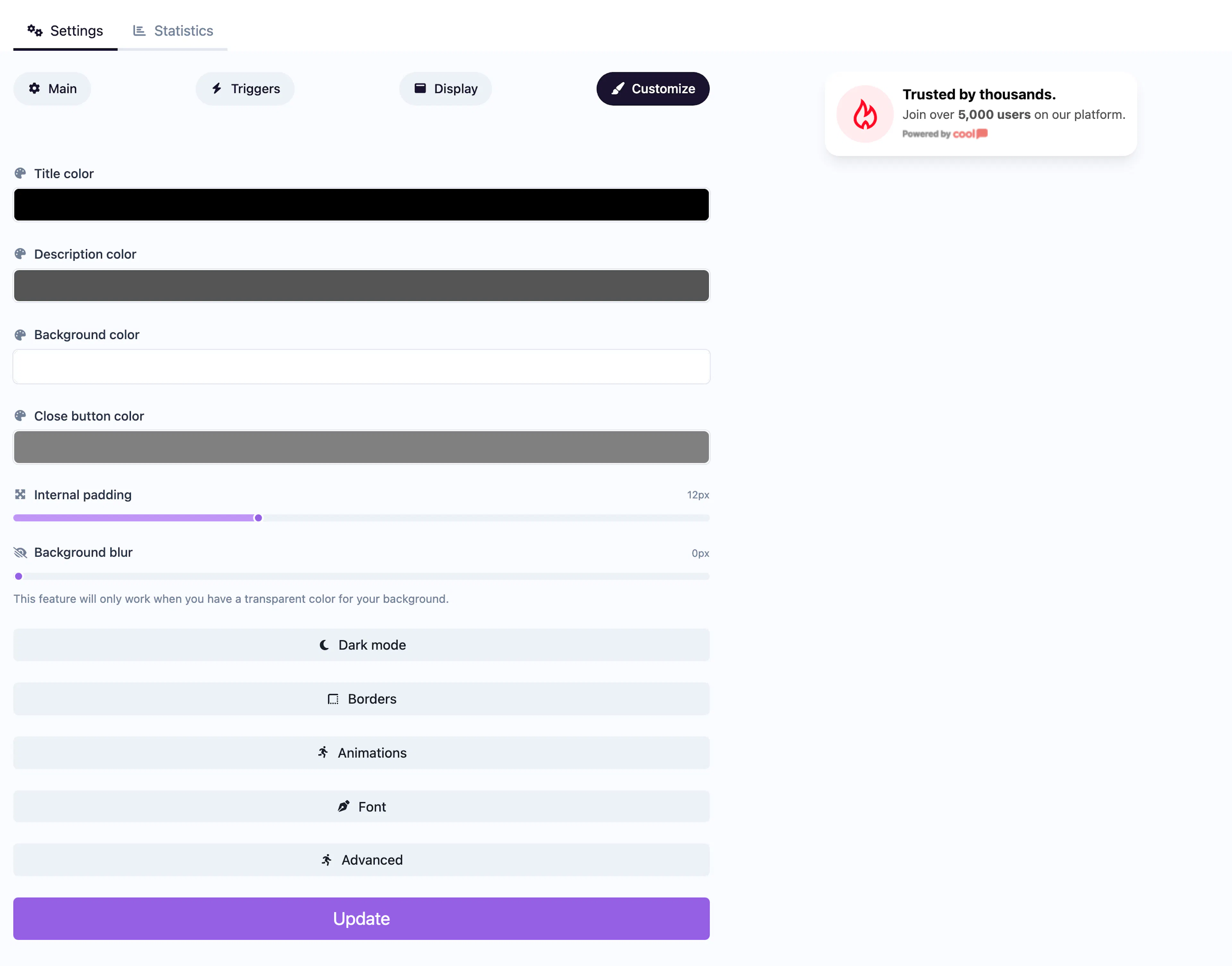
The Customize tab is split into a type-specific section (colors) at the top and shared sections below.
Colors (type-specific)
Each notification type has its own set of color pickers for elements like title text, description text, background, buttons, and close button. These are covered on each type's individual page.
Dark mode
Expand the Dark mode section to set alternative colors for visitors using dark mode. Each color field from the main section has a dark mode counterpart (e.g., dark mode title color, dark mode background color).
Borders
| Field | Description |
|---|---|
| Shadow type | None, small, medium, or large drop shadow. |
| Shadow color | Color of the drop shadow. |
| Border width | Pixel width of the border (0 = no border). |
| Border color | Color of the border. |
| Border radius | Corner rounding in pixels. |
Animations
| Field | Description |
|---|---|
| Hover animation | Effect when visitors hover over the notification: none, scale up (fast/slow), scale down (fast/slow). |
| Entry animation | How the notification appears: fadeIn, slideInUp, slideInDown, zoomIn, bounceIn. |
| Exit animation | How the notification disappears: fadeOut, slideOutUp, slideOutDown, zoomOut, bounceOut. |
| Idle animation | Repeating attention animation: none, heartbeat, bounce, flash, pulse. |
| Animation interval | Seconds between idle animation repeats. |
Font
Choose a font family for the notification text. Options include inherit (uses your site's font) and 16 named fonts such as Arial, Lato, Open Sans, and Roboto.
Advanced
The Custom CSS field lets you inject your own CSS rules to override any styling. This is available on plans that support custom CSS.
Use the browser inspector on the live preview to identify the CSS class names you want to target, then paste your overrides into the Custom CSS field.