Button Bar
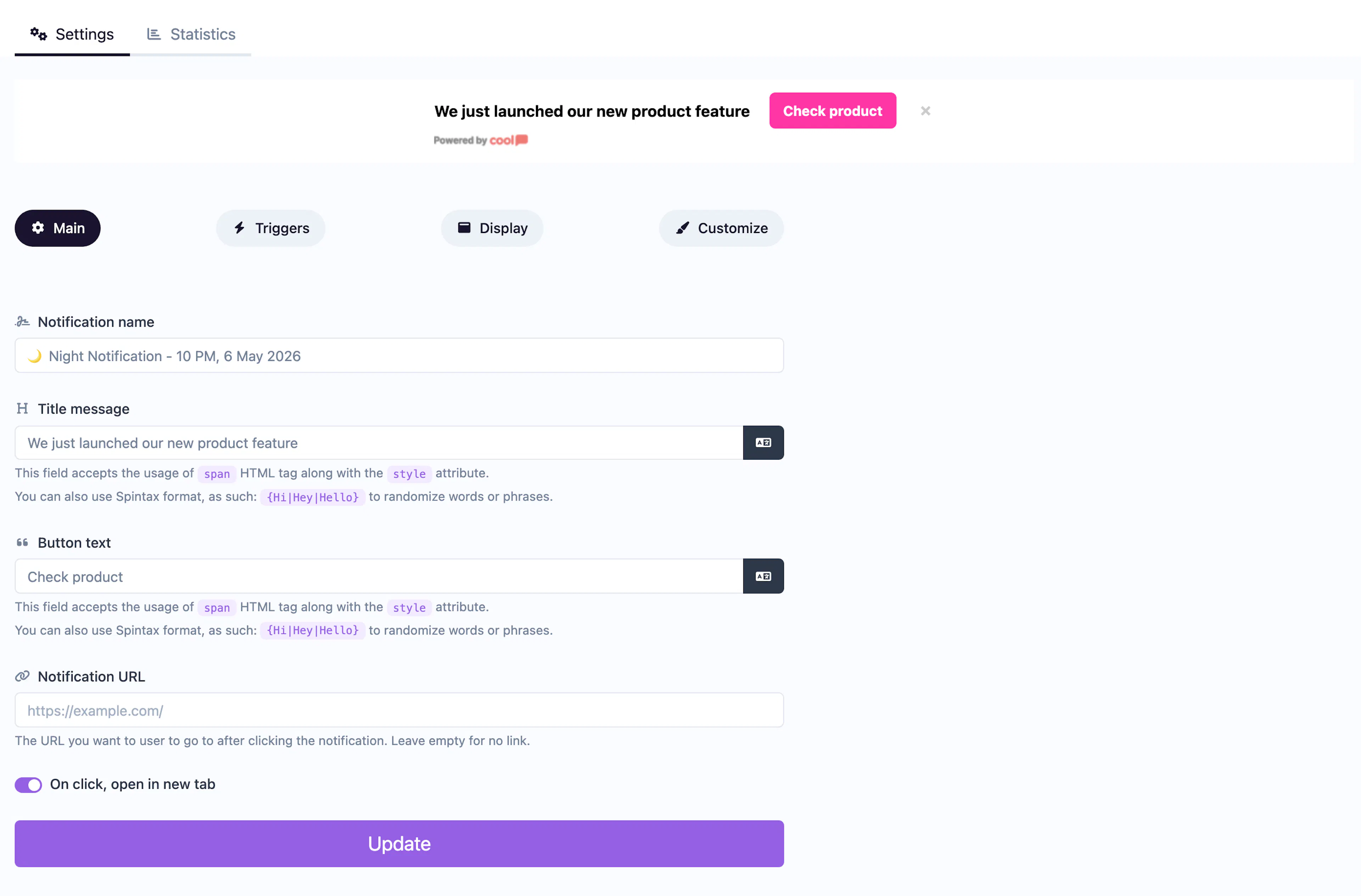
A full-width bar with a title and prominent call-to-action button.
The Button Bar displays a full-width banner with a title and a prominent call-to-action button. It spans the top or bottom of the page, combining a message with a single actionable button.
Main tab fields
| Field | Description |
|---|---|
| Notification name | Internal label for your reference. Not shown to visitors. |
| Title message | The text displayed in the bar. Supports <span> HTML with inline styles and Spintax. |
| Button text | Label for the CTA button (e.g., "Shop Now", "Learn More"). |
| URL | Where the button links to. |
| Open in new tab | Toggle for the URL behavior. |
Customize colors
| Color | Description |
|---|---|
| Title color | Text color of the bar message. |
| Button text color | Text color on the CTA button. |
| Button background color | Background of the CTA button. |
| Background color | Background of the bar. |
For shared settings like triggers, animations, and borders, see the Common Editor Settings reference.
Use cases
- Promotions — "Summer Sale is live!" with a "Shop Now" button.
- Feature announcements — "New feature available" with a "Try It" button.
- Newsletter signups — "Stay updated" with a "Subscribe" button linking to your signup page.
For a bar with a coupon code instead of a button, use the Coupon Bar type. For a modal popup with a button, use Button Modal.
Was this page helpful?