Text Feedback
Collect open-ended written feedback from visitors with a text input and submit button.
The Text Feedback notification displays a prompt with a free-text input field, letting visitors submit written feedback in their own words. Responses are stored in the Data tab for review.
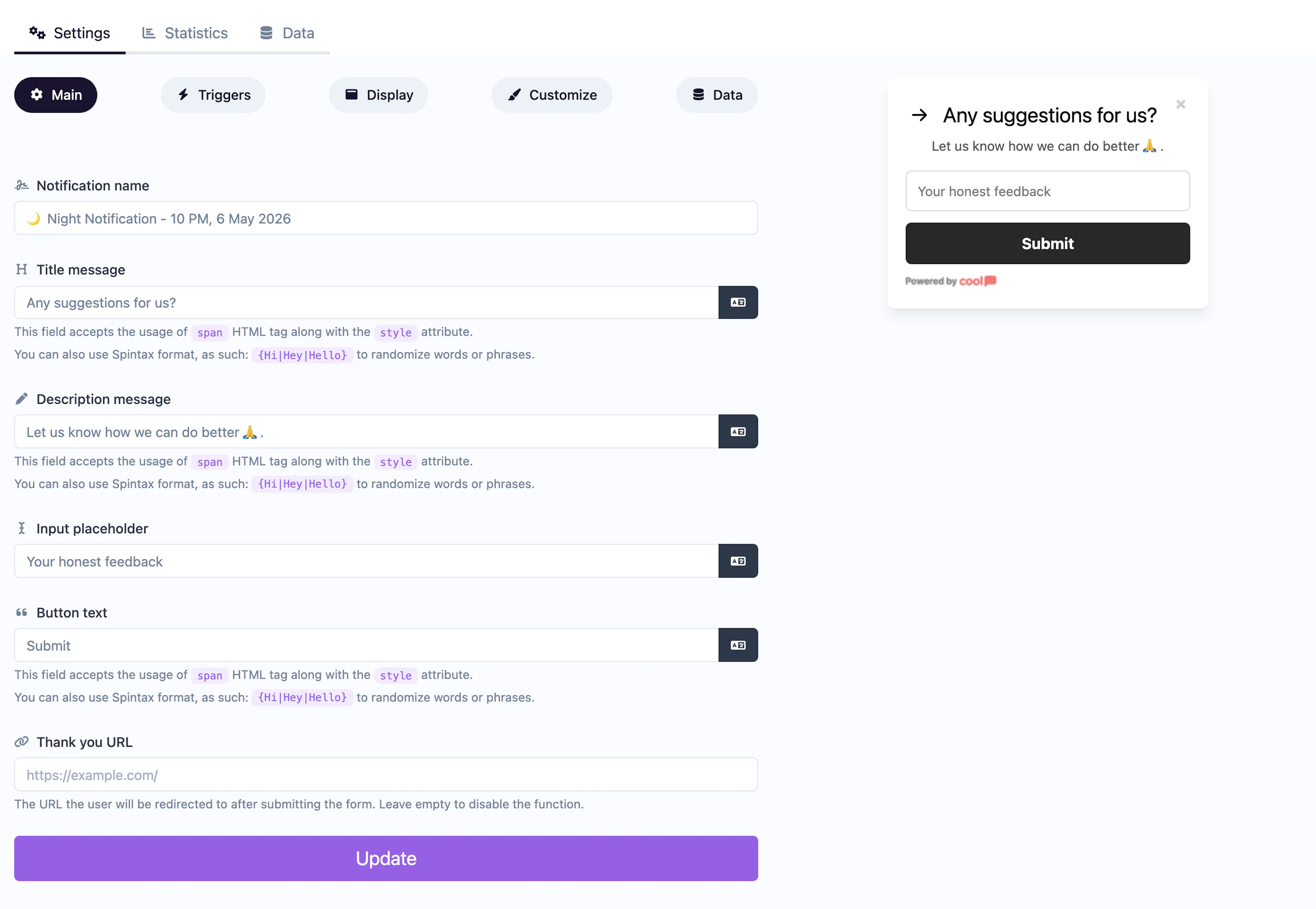
Main tab fields
| Field | Description |
|---|---|
| Notification name | Internal label for your reference. Not shown to visitors. |
| Title message | The question or prompt displayed above the input (e.g., "What can we improve?"). Supports <span> HTML and Spintax. |
| Description message | Supporting context below the title. Same HTML and Spintax support. |
| Input placeholder | Placeholder text inside the text input (e.g., "Type your feedback..."). |
| Button text | Label for the submit button (e.g., "Send Feedback"). |
| Thank you URL | URL to redirect visitors to after submission. Leave empty for a default thank-you message. |
Data tab
The Data tab stores all submitted feedback entries with timestamps.
Customize colors
| Color | Description |
|---|---|
| Title color | Text color of the title/question. |
| Description color | Text color of the description. |
| Background color | Background of the popup container. |
| Button background color | Background of the submit button. |
| Button text color | Text color on the submit button. |
For shared settings like triggers, display position, animations, and borders, see the Common Editor Settings reference.
Use cases
- Product feedback — "What feature would you like to see next?"
- Support follow-up — Ask visitors to describe issues in their own words.
- Content improvement — "How can we make this article better?"
- Exit feedback — "Why are you leaving?" triggered on exit intent.
For quick sentiment without text input, use Emoji Feedback or Score Feedback instead.
Was this page helpful?