Informational Mini
A compact popup with a title and image — no description — for subtle, non-intrusive messages.
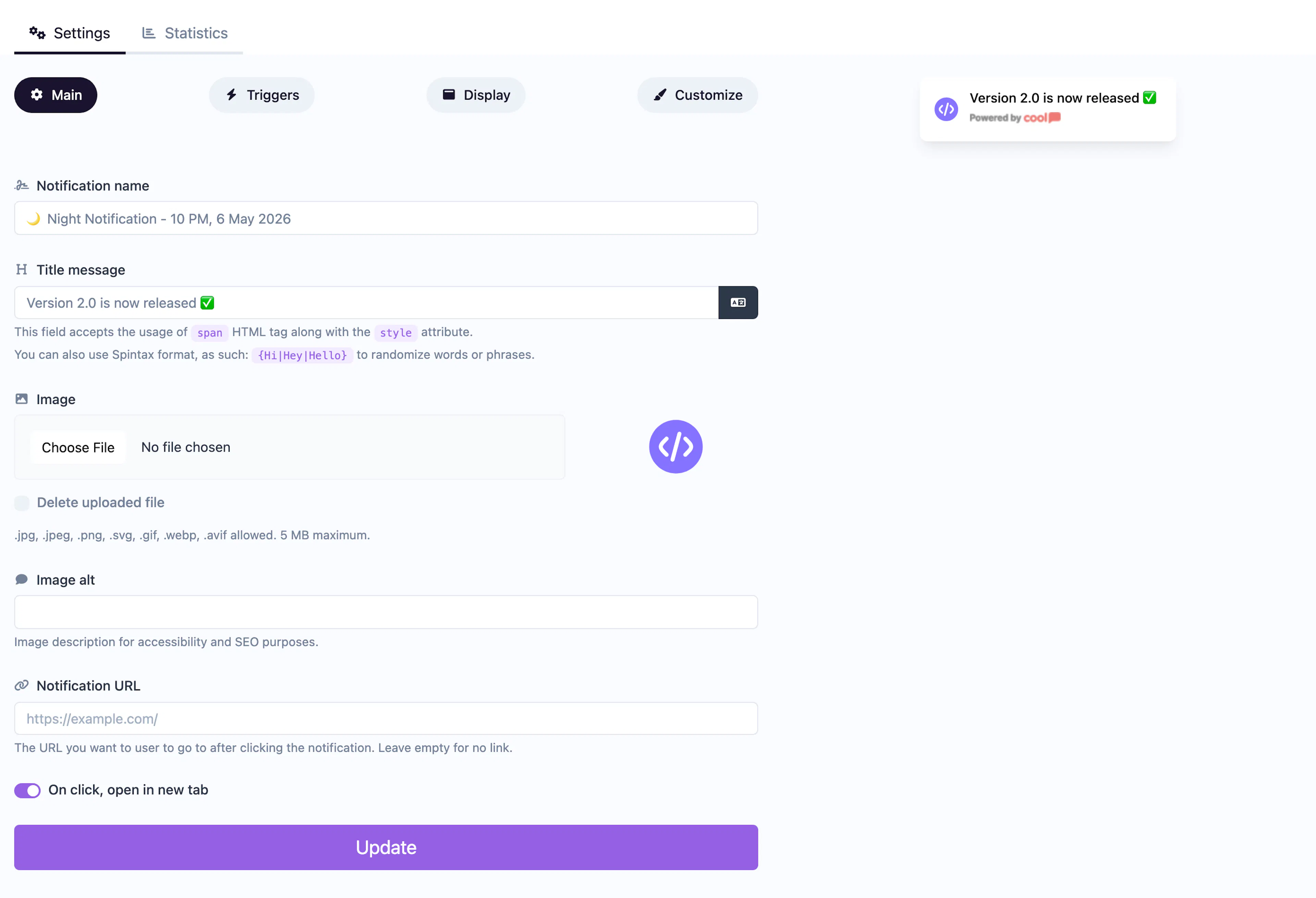
The Informational Mini is a compact version of the Informational notification. It displays only a title and optional image — no description field — making it smaller and less intrusive while still delivering your message.
Main tab fields
| Field | Description |
|---|---|
| Notification name | Internal label for your reference. Not shown to visitors. |
| Title message | The text displayed in the popup. Supports <span> HTML with inline styles and Spintax. |
| Image | Optional small image displayed alongside the title. |
| Image alt text | Accessibility text for the image. |
| URL | Optional click-through URL. |
| Open in new tab | Toggle for the URL behavior. |
Customize colors
| Color | Description |
|---|---|
| Title color | Text color of the title. |
| Description color | Text color (available for styling flexibility). |
| Background color | Background of the popup container. |
| Close button color | Color of the ✕ dismiss icon. |
For shared settings like triggers, display position, animations, and borders, see the Common Editor Settings reference.
Use cases
- Subtle reminders — A small popup nudging visitors without disrupting their experience.
- Quick alerts — Short messages like "New feature available" with minimal footprint.
- Icon-based notifications — Pair a small icon image with a brief message.
For a full-size popup with a description, use the standard Informational type.
Was this page helpful?