Button Modal
A modal popup with a title, description, image, and prominent call-to-action button.
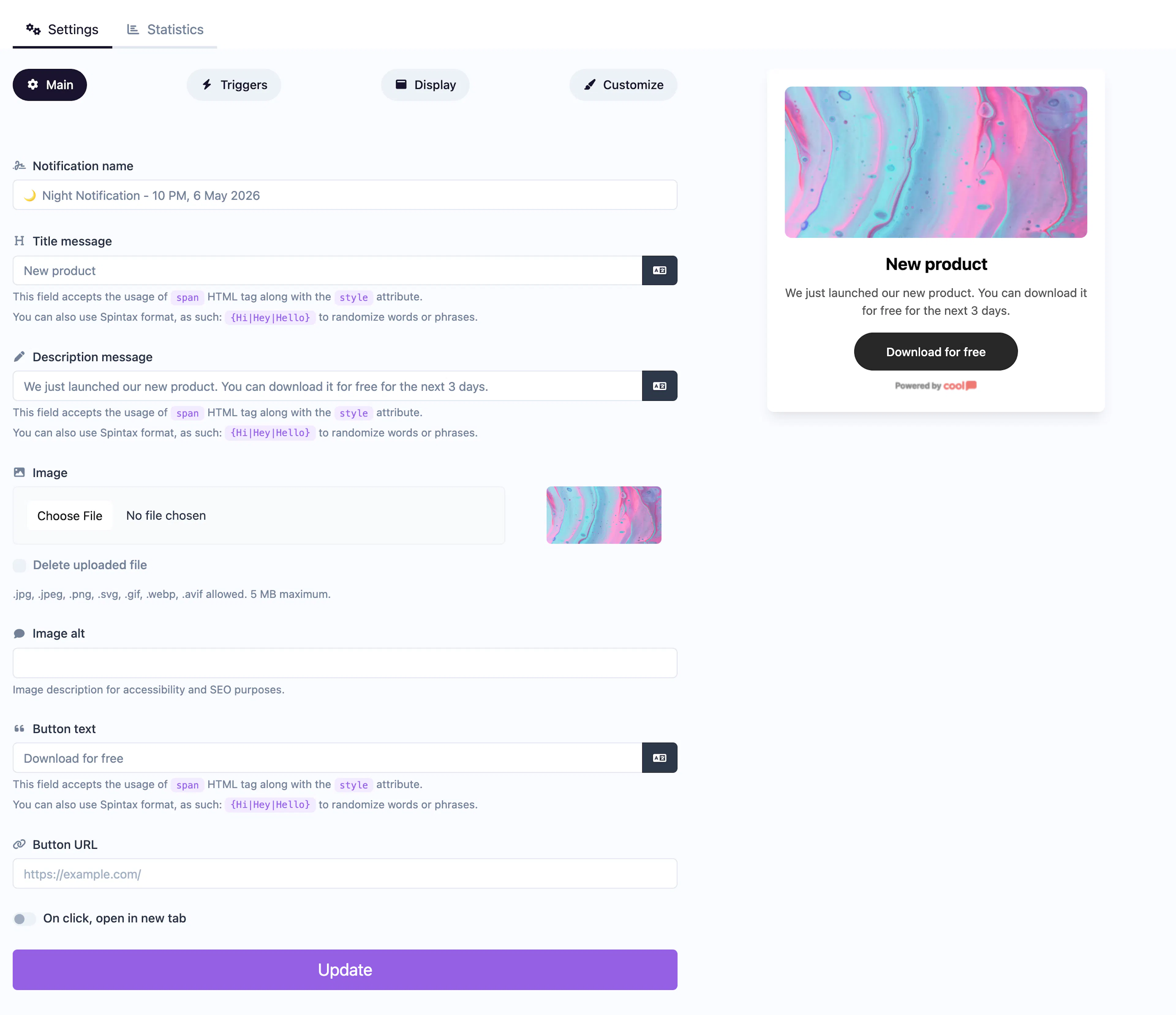
The Button Modal displays a centered modal popup with a title, description, optional image, and a prominent CTA button. It's more visually impactful than corner popups and demands visitor attention.
Main tab fields
| Field | Description |
|---|---|
| Notification name | Internal label for your reference. Not shown to visitors. |
| Title message | The headline displayed in the modal. Supports <span> HTML with inline styles and Spintax. |
| Description message | Supporting text below the title. Same HTML and Spintax support. |
| Image | Optional image displayed in the modal. |
| Image alt text | Accessibility text for the image. |
| Button text | Label for the CTA button (e.g., "Get Started", "Claim Offer"). |
| Button URL | Where the CTA button links to. |
| Open in new tab | Toggle for the button URL behavior. |
Customize colors
| Color | Description |
|---|---|
| Title color | Text color of the title. |
| Description color | Text color of the description. |
| Background color | Background of the modal. |
| Button background color | Background of the CTA button. |
| Button text color | Text color on the CTA button. |
For shared settings like triggers, display position, animations, and borders, see the Common Editor Settings reference.
Use cases
- Special offers — A full-screen-style modal with a compelling offer and CTA.
- Exit intent — Capture leaving visitors with a bold last-chance message.
- Feature launches — Announce a new product or feature with a prominent action.
- Welcome modals — Greet first-time visitors with a branded message and next step.
For a simpler notification without a button, use the standard Informational type. For a bar layout, use Button Bar.
Was this page helpful?