Informational Bar Mini
A compact full-width bar with a title and optional image — the minimal bar notification.
The Informational Bar Mini combines the full-width layout of the Informational Bar with the compact format of the Informational Mini. It displays a slim bar across the top or bottom of the page with just a title and optional image.
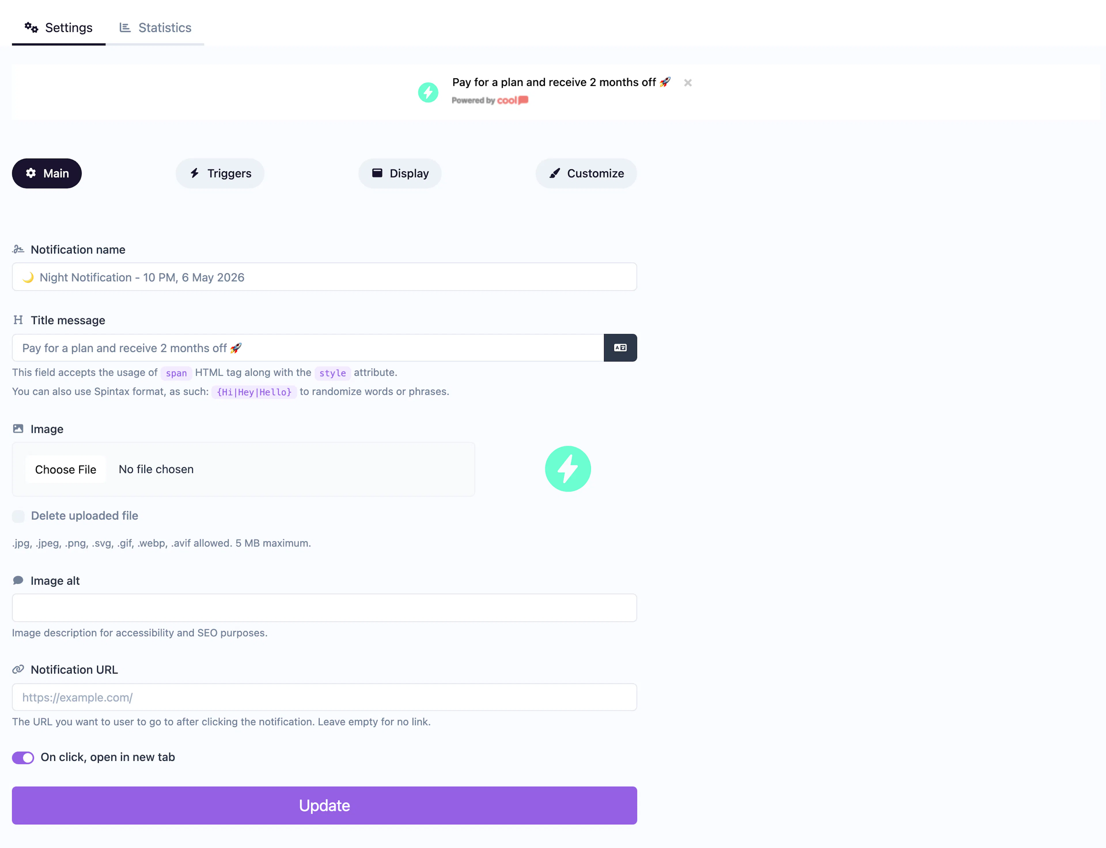
Main tab fields
| Field | Description |
|---|---|
| Notification name | Internal label for your reference. Not shown to visitors. |
| Title message | The text displayed in the bar. Supports <span> HTML with inline styles and Spintax. |
| Image | Optional small image displayed alongside the title. |
| Image alt text | Accessibility text for the image. |
| URL | Optional click-through URL for the entire bar. |
| Open in new tab | Toggle for the URL behavior. |
Customize colors
| Color | Description |
|---|---|
| Title color | Text color of the title. |
| Description color | Text color (available for styling flexibility). |
| Background color | Background of the bar. |
| Close button color | Color of the ✕ dismiss icon. |
For shared settings like triggers, animations, and borders, see the Common Editor Settings reference.
Use cases
- Minimal announcements — A thin bar with a short message like "Free returns on all orders".
- Navigation aids — A persistent top bar linking to an important page.
- Status updates — Brief notices like "We're hiring!" without taking up much space.
For a bar with a description field, use the full Informational Bar type.
Was this page helpful?