Image
Display a prominent image with an optional title and call-to-action button.
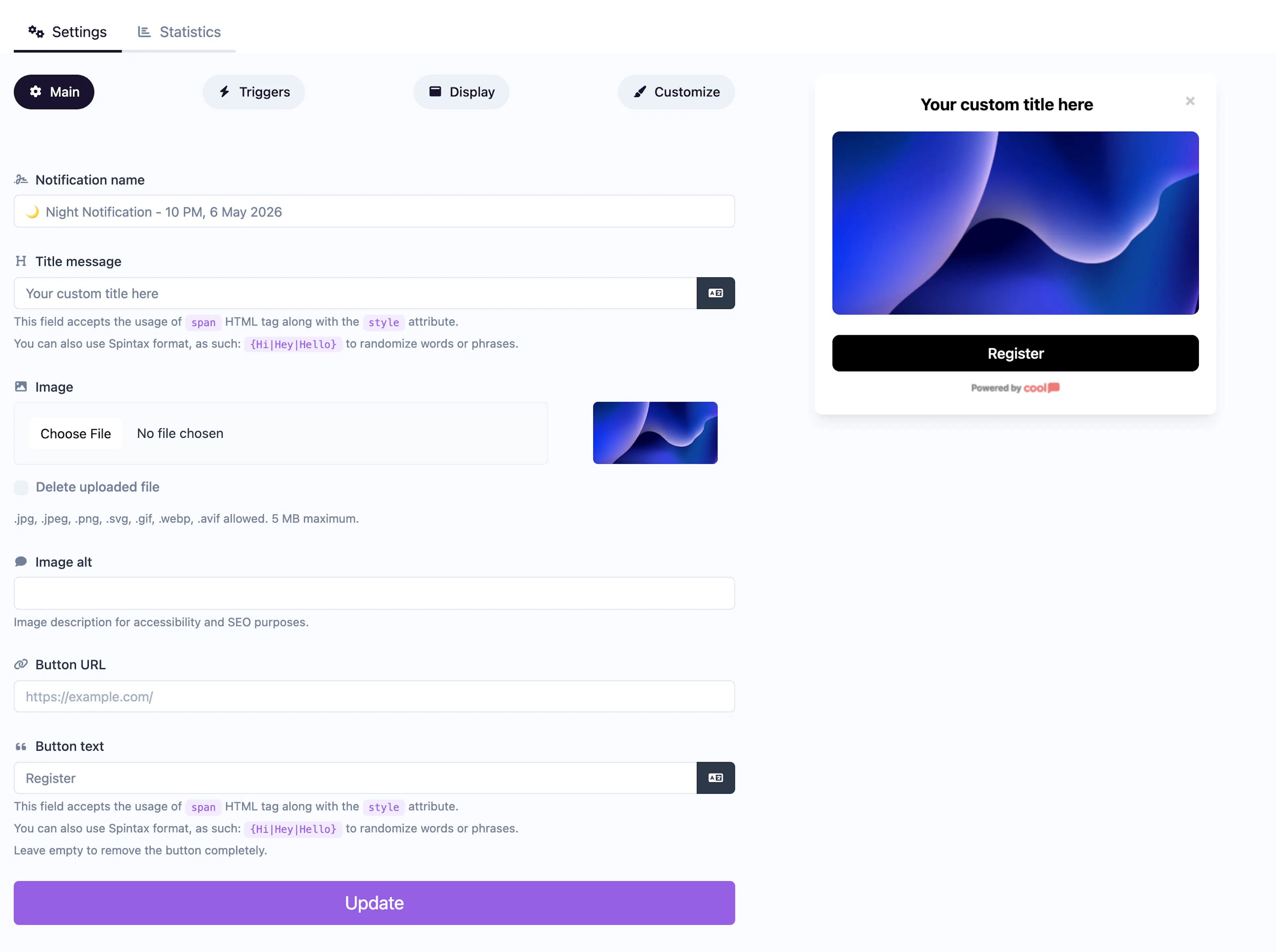
The Image notification showcases a large, featured image as the centerpiece of the popup. It includes an optional title and call-to-action button — ideal for visual promotions, product highlights, or graphic announcements.
Main tab fields
| Field | Description |
|---|---|
| Notification name | Internal label for your reference. Not shown to visitors. |
| Title message | Optional headline displayed alongside the image. Supports <span> HTML and Spintax. |
| Image | The featured image displayed prominently in the popup. Supports cropping in the editor. |
| Image alt text | Accessibility text for the image. |
| Button text | Label for an optional CTA button (e.g., "Shop Now", "View Details"). |
| Button URL | Where the CTA button links to. |
Customize colors
| Color | Description |
|---|---|
| Title color | Text color of the title. |
| Background color | Background of the popup container. |
| Button background color | Background of the CTA button. |
| Button text color | Text color on the CTA button. |
For shared settings like triggers, display position, animations, and borders, see the Common Editor Settings reference.
Use cases
- Product showcases — Display a hero product image with a "Buy Now" button.
- Visual promotions — Show a designed sale graphic with a link to the offer.
- Brand campaigns — Use a striking image to make a visual impact.
- Portfolio highlights — Showcase a featured work with a link to the full project.
For video content instead of a static image, use the Video type.
Was this page helpful?