Notification Types
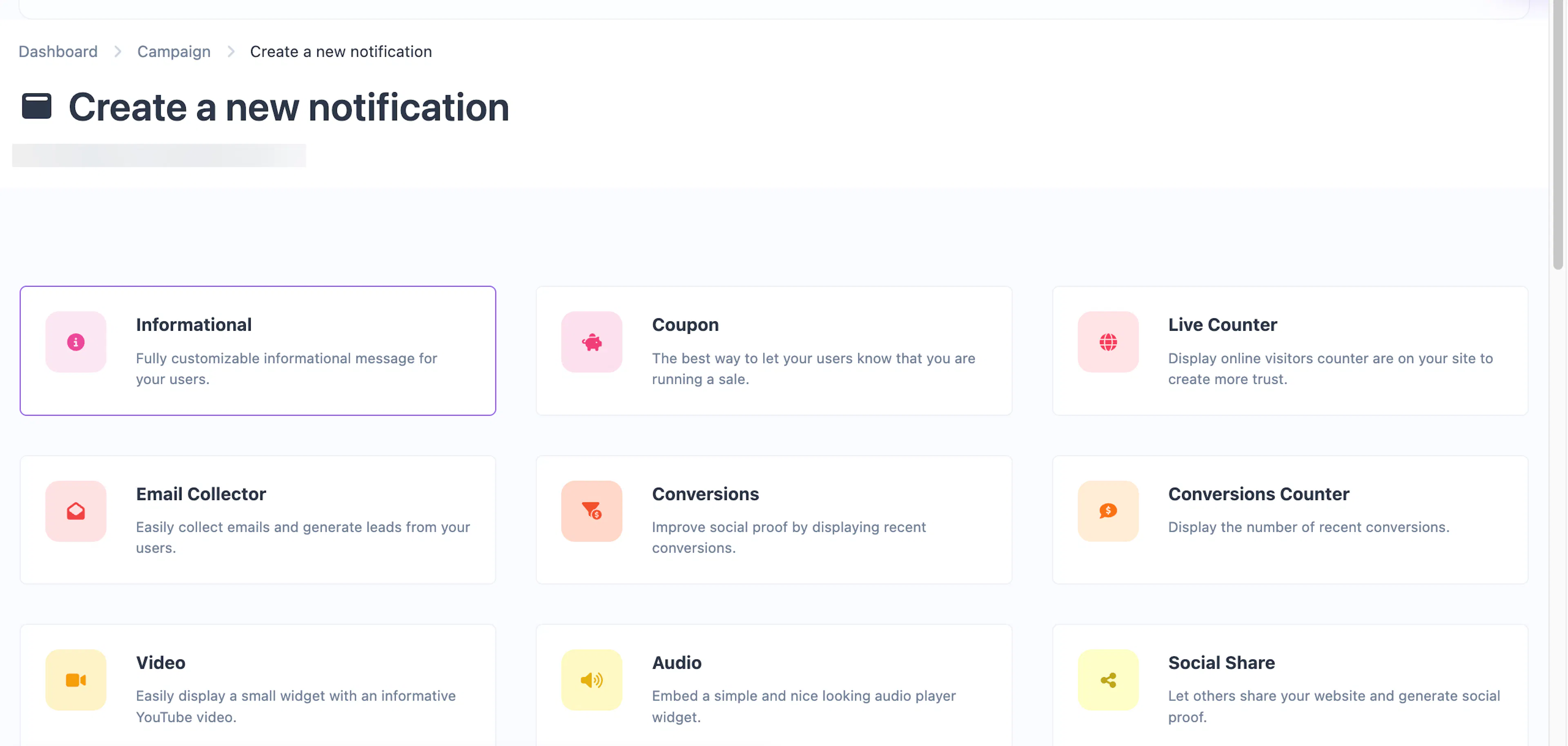
Cool Popup offers 30 notification types across social proof, lead capture, feedback, and engagement categories. Choose the right type for your use case.
Choosing a notification type
When you add a notification to a campaign, you pick from a catalog of types. Each type has a different layout, purpose, and set of configurable options. Your plan determines which types are available to you.
Social proof
These notification types help build trust by showing visitor activity, purchases, and testimonials.
| Type | Description |
|---|---|
| Conversions | Display recent purchase or signup alerts to create urgency and social proof. |
| Conversions Counter | Show the total number of recent conversions (e.g., "142 people signed up today"). |
| Live Counter | Display a real-time count of visitors currently on your site. |
| Reviews | Showcase customer reviews or testimonials in a rotating popup widget. |
Informational
General-purpose popups for announcements, promotions, and messages.
| Type | Description |
|---|---|
| Informational | A fully customizable popup with title, description, image, and link. The most versatile type. |
| Informational Mini | A compact version of the informational popup for short messages. (Pro) |
| Informational Bar | A full-width bar at the top or bottom of the page for site-wide announcements. (Pro) |
| Informational Bar Mini | A smaller top/bottom bar for brief messages. (Pro) |
| Coupon | Highlight a sale or discount with a coupon code that visitors can copy. |
| Coupon Bar | A full-width bar variant of the coupon popup. (Pro) |
| Image | Display a large promotional image with an optional CTA button. (Pro) |
| Video | Embed a YouTube video in a popup widget. |
| Audio | Embed an audio player widget. |
| Custom HTML | Write your own fully custom notification widget with HTML/CSS/JS. |
Lead capture
Collect emails, form submissions, and contact information from visitors.
| Type | Description |
|---|---|
| Email Collector | A popup form to collect email addresses and grow your list. |
| Request Collector | A multi-field form to collect name, email, and a message from visitors. |
| Countdown Collector | Combine a countdown timer with an email form to create urgency. |
| Collector Bar | A top/bottom bar with an email input field — less intrusive than a popup. (Pro) |
| Collector Modal | A large centered modal for collecting leads with high visibility. (Pro) |
| Collector Two Modal | An alternative two-column modal design for lead collection. (Pro) |
Feedback
Gather visitor opinions and ratings.
| Type | Description |
|---|---|
| Emoji Feedback | Let visitors react with emoji to rate their experience. |
| Score Feedback | Collect a numeric score (1–5 or 1–10) from visitors. |
| Text Feedback | Collect written feedback directly from visitors in a text input. (Pro) |
Engagement
Drive social sharing, conversations, and calls to action.
| Type | Description |
|---|---|
| Social Share | Display sharing buttons for popular social networks. |
| Cookie Notification | A consent bar to notify visitors about cookie usage. |
| Button Modal | A modal with a headline, image, and CTA button to drive clicks. (Pro) |
| Button Bar | A top/bottom bar with a CTA button to promote anything. (Pro) |
| Engagement Links | A widget containing categorized links to your social profiles or key pages. (Pro) |
| WhatsApp Chat | A chat widget that opens a WhatsApp conversation with your number. (Pro) |
| Contact Us | Display your contact details (phone, email, WhatsApp, etc.) in a popup widget. (Pro) |
Common features across all types
Every notification type shares the same Triggers, Display, and Customize tabs. These give you fine-grained control over:
- Display triggers — Show after a time delay, scroll depth, exit intent, pageview count, element click/hover, or user inactivity.
- Frequency — Every time, once per session, or once per browser.
- Targeting — Filter by device type, OS, browser, continent, country, city, and language.
- Scheduling — Set start and end dates for time-limited promotions.
- Positioning — Place in any corner or as a floating top/bottom element.
- Animations — Entrance, exit, and attention-grabbing animations (fade, slide, bounce, pulse, etc.).
- Dark mode — Alternate color scheme for visitors using dark mode.
- Custom CSS — Your own CSS for pixel-perfect styling.
- Branding — Show or hide the "Powered by" badge.
See the Common Editor Settings page for full details on every option.